Understanding Inequality, Part I
Between World War II and the 1970s income disparities in America were relatively narrow. Some people were rich and many were poor, but overall inequality among Americans in terms of wealth, income and status was low enough that the country had a sense of shared prosperity. Things are very different today, as American society is beset by extreme inequality, economic fragmentation and class warfare.
What happened? The economic data show a huge widening of disparities in income and wealth starting around 1980, eventually undermining the relatively equal distribution of income we had from the 40s to the 70s. Moreover, growing disparities in income have led to growing disparities in political influence and the reemergence of what feels more and more like an oppressive class system.
So today’s post is the first of two posts exploring the rise of American inequality and its consequences. This will be a double-header because I feel I need a whole post to discuss what I believe to be the most important factor in rising inequality, the shift in political and bargaining power against workers.
Beyond the paywall I’ll address four issues:
1. Four facts about inequality that any story should explain
2. The role of globalization
3. Did technology do it?
4. The role of power
Four facts about Inequality
Families at the 95th percentile — richer than 95 percent of their compatriots — probably consider themselves well off but not rich. In 1950 they earned 2.43 times as much as the median family — the family right in the middle of the income distribution. By 1980 that ratio was 2.62 — not much change over 30 years. But by 2023 families at the 95th percentile were earning 3.54 times as much as the median family. In other words, by 2023 well-off Americans had pulled away from those below them in the income distribution.
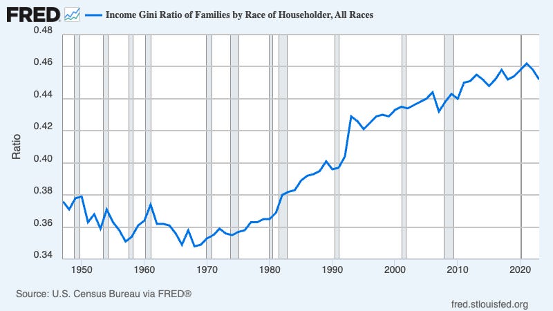
There are a number of ways to measure inequality. I tend to prefer simple ratios like the ones above, but other economists prefer more complex measures like the “Gini coefficient.” I won’t try to explain how that coefficient works, but here’s what it looks like over time:

Whatever measure you use to quantify inequality, they all tell the same story:
*Inequality fact #1*: Inequality was fairly low and stable from the 1940s until around 1980, but has increased dramatically since then.
When it first became clear that U.S. inequality was rising, many observers tried to deny what was happening. Yes, their main motivation was political. I published an article, “The rich, the right, and the facts,” debunking various forms of inequality denial — *in 1992*. You might think the most obviously false arguments would have gone away since then. But bad arguments in the economics of inequality never go away — at best they lie fallow for a few years before reappearing.
In fact, there was a clear break in trend circa 1980. Inequality, which had been stable for decades, suddenly began climbing rapidly.
Importantly, this wasn’t just a matter of the top quintile — the richest 20 percent of the population — pulling away from the bottom 80 percent. Instead, we also saw radical increases in inequality *within* the top 20 percent. That is, the rich were pulling away from the merely affluent, and the ultra-rich were pulling away from the merely rich. Here’s a stunning chart from the [Congressional Budget Office](https://www.cbo.gov/system/files/2024-09/60342-Trends-Income.pdf):
s_!cktv!,w_1456,c_limit,f_auto,q_auto:good,fl_progressive:steep/https%3A%2F%2Fsubstack-post-media.s3.amazonaws.com%2Fpublic%2Fimages%2F85f90d2c-a11e-4d60-a88c-23a9afdeb74a_2144x1210.png)
What this graph tells you is that within the top 1 percent of the American income distribution, the top one-tenth of 1 percent were pulling away from the rest of the top 1 percent, and the top one-hundredth of 1 percent were pulling away from the rest of the top one-tenth of 1 percent. That is, even within the top 1 percent, inequality has exploded.
This leads us to our second fact:
Inequality fact #2: Income gains have been bigger the further you go up the income scale, with huge gains at the very top.
Now, I’ve said that the U.S. distribution of income was relatively stable from the 1940s until around 1980. But it hadn’t always been stable. People often call the period we’re living in a “New Gilded Age,” in recognition of an earlier era of extreme income and wealthy inequality. For the purpose of comparison, can we document that earlier era statistically?
Much of what we know about modern inequality comes from surveys that didn’t begin until the 1940s. We do, however, have other sources of data, especially for high-income individuals who began paying income taxes in the United States after 1913 and in the UK much earlier. These data can be used to produce estimates of the share of income going to top income groups over the past century or more, such as this chart from the World Inequality Database estimating the share of total income going to the richest one percent from 1909 to 2023:

This graph and similar estimates consistently show high inequality in the early part of the 20th century, much lower inequality for several decades after World War II, and then a return to, well, a second Gilded Age. So here’s our third fact:
*Inequality fact #3: Inequality in the United States has followed a U-shaped pattern over time: starting from a high level, then falling, then rising to a high level again.*
Finally, the chart above shows that inequality didn’t smoothly decline during the first half of the 20th century. Instead, it declined rapidly, falling off a a cliff between the late 1930s and the late 1940s. This pattern is repeated in other sources, so it’s not a quirk of the particular data being used.
In a [celebrated paper](https://www.jstor.org/stable/2118322) the economists Claudia Goldin and Robert Margo, using detailed wage data from the Census, identified this phenomenon, which they called the “Great Compression,” and showed that it happened between 1940 and 1950. They focused on the 90-10 ratio — the ratio of wages at the 90th percentile to wages at the 10th percentile, which looked like this over time:
s_!X0c1!,w_1456,c_limit,f_auto,q_auto:good,fl_progressive:steep/https%3A%2F%2Fsubstack-post-media.s3.amazonaws.com%2Fpublic%2Fimages%2F45d5aa6d-e411-4a55-984e-8032ec46bfde_996x604.png)
What they showed was that the 90-10 ratio (and other measures of wage inequality) suddenly declined in the 1940s, then stayed low for several decades before widening again. This is consistent with what we see in data on the share of income going to the top 1 percent. The relatively equal income distribution of postwar America didn’t evolve gradually. Instead it emerged quite suddenly, roughly during World War II, and didn’t disappear until decades after World War II ended. So here’s our fourth and final fact:
Inequality fact #4: The era of relatively low inequality began suddenly, but persisted for decades.
So whatever theory you use to explain rising inequality must be consistent with these four facts.
Was it globalization?
International trade both grew rapidly and changed its character beginning in the 1970s. Until then, to the extent that America imported manufactured goods, it did so mainly from other high-wage nations. What we bought from poorer countries — what we now call emerging markets — were mainly minerals like oil and agricultural products like coffee and bananas. In the 70s, however, a widening range of emerging markets began exporting labor-intensive manufactures like apparel. Also, falling costs of transportation caused in large part by containerization made it possible to break up production of goods like automobiles and computers into stages, and carry out the labor-intensive parts of the process in low-wage nations like China or Vietnam.
Standard international trade theory says that importing goods made by blue-collar workers while exporting goods whose production requires many workers with college degrees reduces the demand for less-educated workers while increasing the demand for more-educated workers, increasing wage inequality. And there’s no question that this happened. The question instead is how much it contributed to the story of rising inequality.
There are three main reasons to believe that globalization’s role was limited. One, which I partially documented a couple of weeks ago, is that the numbers just aren’t big enough. I could go into that at much greater length, and (along with many other researchers) did in multiple papers during the 1990s. But probably more than you want to know. Basically the math says that globalization wasn’t the main driver of inequality.
A second reason for doubting the claim that globalization drove inequality is that globalization widens inequality by widening the pay differential between highly educated and less educated workers. But while a widening pay gap based on education explains part of rising inequality in the 1980s and 1990s, the education pay gap stopped rising after 2000, yet inequality continued to increase, a pattern inconsistent with the idea that globalization is the main driver of inequality. Here’s a helpful chart from the Economic Policy Institute:

So something else was going on.
Finally, globalization can’t explain the huge increases in inequality *among* highly educated workers. Look again at that CBO chart about income growth within the top 20 percent and see the stunning growth of incomes among the top .01 percent — that is, the top *one-hundredth of one percent* . Or think of it this way: high-school teachers and CEOs have similar educational levels, but haven’t exactly experienced similar income trajectories.
So while globalization surely played some role in rising inequality, it can’t have been the main story.
*Biased technological change*
Personal computers began appearing on peoples’ desks in the early 1980s. I still remember my first PC, which had no graphics and displayed text in any color you wanted as long as it was green — and how big a deal it nonetheless seemed at the time. The introduction of microcomputers roughly corresponds to the point at which U.S. inequality began rising.
In the 1990s many economists, aware that the numbers didn’t add up for a globalization-based explanation of rising inequality, argued that the explanation lay with technology instead. Specifically, they suggested that “skill-biased technological change” — technology that reduced the demand for less-educated workers while increasing demand for the highly educated — was the main culprit. This story was so widespread that people in the field would rattle off the acronym SBTC, assuming that everyone knew what they meant.
In 2008 Claudia Goldin and Lawrence Katz published a book, “[The race between education and technology](https://www.hup.harvard.edu/books/9780674035300),” putting SBTC at the heart of their story. Yes, that’s the same Claudia Goldin who helped discover the Great Compression, and would later win a richly deserved Nobel for her many contributions to labor economics. And Katz is also one of our greatest labor economists.
Yet in 2002 David Card — another future Nobelist — and John DiNardo published a [critique of SBTC](https://davidcard.berkeley.edu/papers/skill-tech-change.pdf) that was, for an academic paper, remarkably blunt:
> Our main conclusion is that, contrary to the impression conveyed by most of the recent literature, the SBTC hypothesis falls short as a unicausal explanation for the evolution of the U.S. wage structure in the 1980s and 1990s. Indeed, we find puzzles and problems for the theory in nearly every dimension of the wage structure … we argue that the SBTC hypothesis by itself is not particularly helpful in organizing or understanding the shifts in the structure of wages that have occurred in the U.S. labor market.
At the risk of greatly oversimplifying their detailed discussion, I’d say that they identified more or less the same problems with SBTC I mentioned for attempts to explain inequality with globalization. Computers can’t explain why inequality has continued to rise even though the wage premium for education has stagnated, or why the .01 percent are pulling away from everyone else.
I should mention one quite different story about technology and inequality: Sherwin Rosen’s “superstar” hypothesis. Rosen argued that modern technologies, especially communication, broadened the reach of talented individuals in a variety of fields. Rosen originally envisaged comedians, whose audience was previously limited to the number of people who could fit in an auditorium, but eventually were able to reach huge audiences on TV. He suggested that this change increased inequality *among the talented*: The very funniest comedians would be making millions laugh in front of their TVs, while slightly less funny types would still be working the Borscht Belt.
There’s actually [some evidence](https://www.aeaweb.org/research/technical-change-superstar-television) for this hypothesis, and it needn’t apply only to entertainers. For example, does modern telecommunications allow star attorneys to be lead attorney on multiple cases?
I’m personally fascinated by the superstar hypothesis, partly because I can see some signs of it in the academic world. But I think pursuing it would take this post too far afield. I’ll come back to it another time.
*Power*
I’ve argued that neither globalization nor skill-biased technological change are adequate explanations of the huge rise in income inequality that has taken place since 1980. But in that case what is the story?
My preferred answer focuses largely on power. By this I partly mean explicit political power. There was clearly a turning point on inequality around 1980. What happened then? As noted above, that date corresponds roughly to the rise of modern manufacturing globalization. It also corresponds to the rise of microcomputers. But it corresponds to one more thing: The election of Ronald Reagan and a general rightward shift in American politics.
What about the big move toward *reduced* inequality — the Great Compression — in the 1940s? FDR’s New Deal controlled the government then, and had since 1933. However, World War II gave the New Deal vastly expanded power to reshape the economy.
In any case, power is about more than controlling Congress and the White House. It’s also about institutions and social norms that can enhance workers’ position in bargaining with employers and limit the opportunity for members of the elite to enrich themselves through self-dealing.
Here’s one chart that previews some of the arguments I’ll be making next week. It shows union density — the percentage of workers who are union members — over time:
s_!hSOC!,w_1456,c_limit,f_auto,q_auto:good,fl_progressive:steep/https%3A%2F%2Fsubstack-post-media.s3.amazonaws.com%2Fpublic%2Fimages%2Fdf366802-812f-49c4-8f00-bb9d321689c3_1190x692.png)
Source: Congressional Research Service
The correlation with both the Great Compression and the post-1980 rise in inequality is obvious.
However, laying out the ways in which power can explain the fall and rise of inequality will take a lot of time and space. So will laying out the problems with that argument — for it, too, has some weak points.
So, to be continued, probably next week.
Write a comment