Five conversion leaks I keep seeing on Bitcoin and Nostr project pages
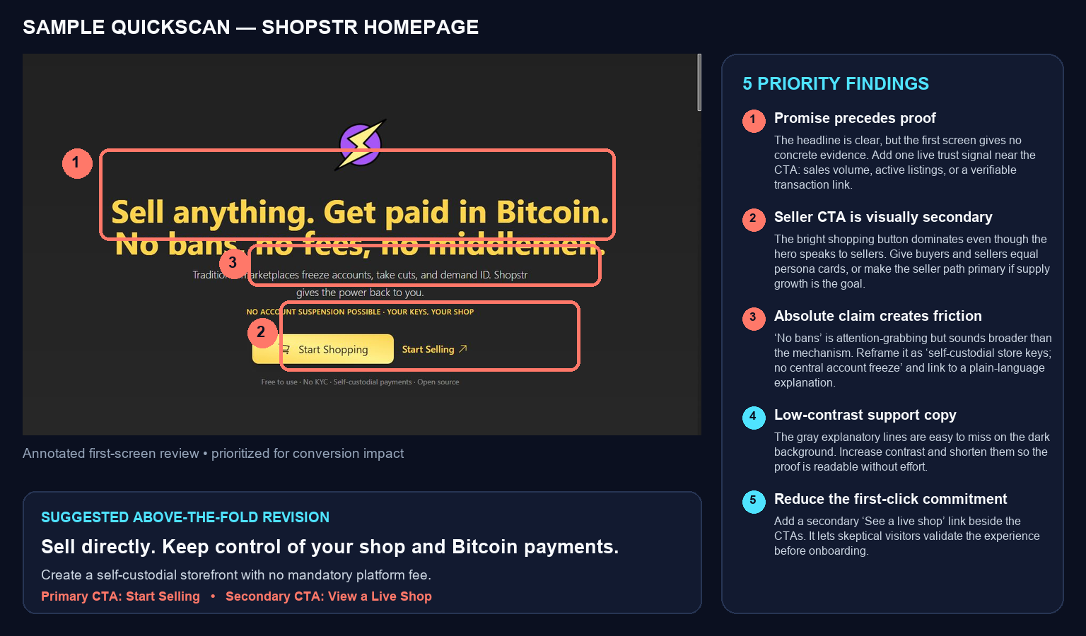
- 1. The mechanism arrives before the outcome
- 2. The CTA hierarchy disagrees with the page’s goal
- 3. The promise and its proof live too far apart
- 4. A trust contradiction appears after commitment
- 5. Safety, accessibility, and first-run friction are treated as appendices
- A 15-minute version of this audit
I have been doing short feedback passes on public pages and onboarding docs from Bitcoin and Nostr builders who asked for critique.
The projects were very different: wallet documentation, relay-based apps, commerce plugins, research dashboards, media tools, and donation pages. But the same five leaks kept appearing.
By “conversion,” I do not just mean a sale. It can mean reading the right guide, trying a demo, downloading a release, making a donation, creating a first wallet, or completing a safe first run. The question is simply: does the page help the right visitor take the right next step?
1. The mechanism arrives before the outcome
Bitcoin and Nostr builders naturally care about the architecture. New visitors usually care first about what changes for them.
I saw pages lead with NIP numbers, relay behavior, key models, and infrastructure vocabulary before stating the practical payoff. The details were often good; they were just early.
A better order is:
Outcome: Discord-style group chat your community can run on the relay it chooses.
Mechanism: Built on NIP-29, with portable identity and relay choice.
The five-second test: show only the first screen to someone in the intended audience. Can they say what the product does, who it is for, and why they might care without knowing the protocol vocabulary?
Keep the protocol. Let the outcome introduce it.
2. The CTA hierarchy disagrees with the page’s goal
One page spoke almost entirely to sellers, but its largest button sent visitors shopping while “start selling” looked secondary. Another buried the action to read issue one beneath a ticker, system statistics, a clock, and several atmospheric cards.
Those pages did not lack calls to action. They lacked a decision about which action mattered most.
For a multi-role product, label paths by benefit:
- Try in browser — no install
- Get the native app
- Start selling
- View a live shop
If one side of the marketplace is the current bottleneck, the visual hierarchy should admit it.
A useful blur test: squint at the first screen until the words disappear. The first element that still attracts your eye should correspond to the page’s actual priority.
3. The promise and its proof live too far apart
“Open source,” “private,” “self-custodial,” “no tracking,” and “transparent” are meaningful claims. They are also easy to write.
Several pages made strong claims in the hero, then placed the evidence much later—or omitted the most useful evidence entirely. I found beta warnings separated from download buttons, open-source claims without a direct source link, and polished concept art where one real product screenshot would have carried more trust.
Put one concrete signal beside the promise:
- a real interface screenshot or short capture;
- a direct source link and exact deployed commit;
- a current release artifact and checksum;
- a live example people can inspect before onboarding;
- a dated metric with a verifiable source;
- a completed donation or project record with privacy-safe evidence.
One specific proof point is usually stronger than another paragraph of adjectives.
4. A trust contradiction appears after commitment
The most damaging wording problems were not spelling mistakes. They were small contradictions that made a careful visitor pause:
- a hero promised “one password,” while the product actually generated a secure passphrase;
- a prominent download action appeared beside “no releases found”;
- “zero central servers” described a product that intentionally uses relays;
- a transparency promise had no visible route to the proof-of-work page;
- impact counters displayed zero while another page already showed a contribution.
Each statement can have an innocent explanation. The visitor should not have to invent it.
Try a skeptical-reading pass: write down every absolute claim and every action that asks for trust, access, a signature, a download, or money. Then find the strongest qualifier elsewhere on the page. If that qualifier changes the decision, move it beside the action.
This is not about making the page timid. Precise claims are often more persuasive because they explain the mechanism. “Self-custodial store keys and no central account freeze” is more useful than an absolute slogan whose boundaries are unclear.
5. Safety, accessibility, and first-run friction are treated as appendices
A warning that appears after someone imports a key is not onboarding. A hover-only explanation is not available on touch or keyboard. An animated sentence without a complete static fallback can briefly expose nonsense to assistive technology.
Recent examples included:
- irreversible-action guidance placed below the route that triggers the action;
- sensitive signing fields not shown until late in a flow;
- important matrix context available only on hover;
- moving tickers without a reduced-motion fallback;
- raw configuration formats where a preset and validation check would prevent errors;
- a minimal commerce-plugin setup that enabled a fallback path while leaving its required webhook secret blank.
These are conversion issues because a visitor who cannot understand, trust, or complete the first run leaves.
Before launch, try the path in a clean browser profile, with keyboard navigation, on a narrow screen, and with reduced motion enabled. Deliberately trigger one failure. Put irreversible warnings before the relevant action, not in the appendix.
A 15-minute version of this audit
- Choose one primary visitor and one next action.
- Read only the first screen: outcome, audience, and action should all be clear.
- Circle each trust claim and place one piece of evidence near it.
- Compare every headline promise with the qualifications, warnings, and release status below.
- Complete the path once as a newcomer, including one failure state and a keyboard-only pass.
Then prioritize by likely visitor impact, confidence in the diagnosis, and implementation effort. The highest-value fix is often not a redesign. It may be moving one sentence, renaming one action, or putting existing proof beside an existing promise.
Which of the five is hardest on your own project: explaining the outcome, choosing the CTA, showing proof, qualifying claims, or smoothing the first run?
If you want this applied to one public page, I offer a bounded five-fix QuickScan for $10 in bitcoin: https://shopstr.store/listing/naddr1qvzqqqrkcgpzqdkeef64rl204p6xxkzwys9z6ygfw5w8kezc8us6xlplequuws6pqy28wumn8ghj7un9d3shjtnyv9kh2uewd9hsqsr9xsungc3j8yurqenyvcmryvp4xuerqwfkxqmkgcfcx5mrywrpvfsnwcf3xccnwwrxxsenqve3vd3kgetzxymrvve3xyexydmpv5crg6g9hj5
Write a comment